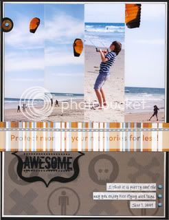
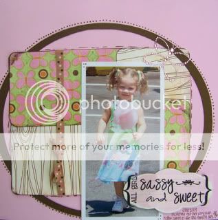
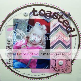
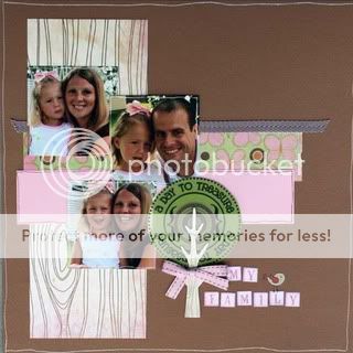
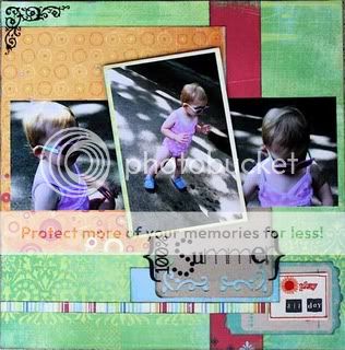
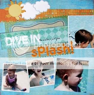
You might already be doing this or something similar but I thought I would share here my “technique” for positioning my titles so that they look good, either in a curve, straight, or however else!
All you need is a clear cellophane wrapper that many of our papers and scrapping supplies come in and of course whatever alphas you want to use for your title/sentiment.
First, I put the cellophane on top of my layout in progress and then I stick, as lightly as possible, the alphas I want to use where I think I want them on the page. Thanks to the clear wrapper, I can have an idea of what it would look like BEFORE I actually stick them on the paper/photos.

 And because my alphas are on the clear sheet, I can move my title/sentiment around by just moving the cellophane paper. In this case I did not like the result so all I had to do is reposition the alphas on my cellophane to find another look. Here I am “testing” another option:
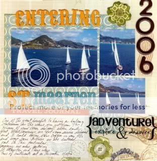
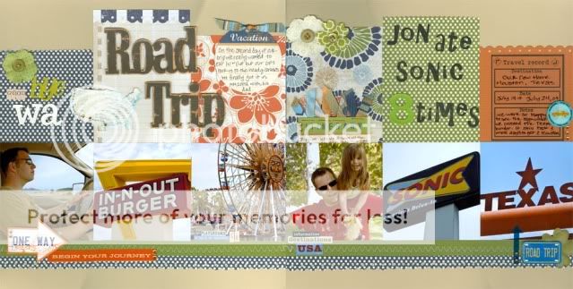
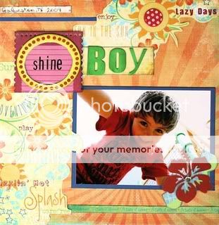
As you can see in the final page below, I went with my second option. Once I like the look, all I have to do is transfer the alphas from the cellophane paper to my page and I know exactly where to start and position them in relation to the elements of my page.

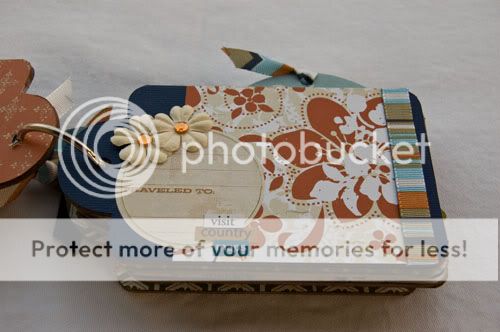
I do this all the time! Here is another example with a card. I might check several positions before I find one I like.


I’d love to hear about it if you give it a try or if you have another technique to share for “perfect” titles!